| Welcome, Guest |
You have to register before you can post on our site.
|
| Latest Threads |
First Ideas by a new user
Forum: Analysis of the text
Last Post: pjburkshire
34 minutes ago
» Replies: 1
» Views: 53
|
The 'Chinese' Theory: Fo...
Forum: Theories & Solutions
Last Post: Jorge_Stolfi
3 hours ago
» Replies: 1,109
» Views: 454,677
|
f58v Visual Code, Weird S...
Forum: Imagery
Last Post: nablator
6 hours ago
» Replies: 26
» Views: 1,515
|
Old Czech (Bohemian) or M...
Forum: Theories & Solutions
Last Post: pjburkshire
9 hours ago
» Replies: 80
» Views: 12,379
|
No text, but a visual cod...
Forum: Theories & Solutions
Last Post: Antonio García Jiménez
10 hours ago
» Replies: 1,961
» Views: 1,637,752
|
One author, working a sea...
Forum: Theories & Solutions
Last Post: ololololo
10 hours ago
» Replies: 1
» Views: 103
|
Circular text in the Voyn...
Forum: Theories & Solutions
Last Post: Voynich1234
11 hours ago
» Replies: 20
» Views: 1,944
|
Voynichese is a numeric c...
Forum: Theories & Solutions
Last Post: ololololo
Yesterday, 11:25 AM
» Replies: 296
» Views: 67,276
|
f57v – Are the empty ring...
Forum: Physical material
Last Post: Jorge_Stolfi
Yesterday, 07:04 AM
» Replies: 13
» Views: 1,232
|
Poll on f116v Voynichese ...
Forum: Marginalia
Last Post: Jorge_Stolfi
21-11-2026, 11:10 PM
» Replies: 7
» Views: 698
|
|
|
| Advice on transcription loci, writing rows and uncertain readings |
|
Posted by: GundamChunk - 07-11-2026, 06:41 PM - Forum: Analysis of the text
- Replies (3)
|
 |
Hi everyone, I’m Chunk. I’ve been working on a small Voynich text-analysis project, and I’d appreciate some advice on getting the transcription and page layout documented properly.
I’m looking at You are not allowed to view links. Register or Login to view. and You are not allowed to view links. Register or Login to view. using IT2a and ZL3b. How do you distinguish transcription loci from the actual writing rows and paragraphs on the page, especially when their numbering or boundaries don’t line up neatly?
I’d also like to know how you document uncertain glyphs, partial tokens, and disagreements between transcriptions while preserving the alternative readings. Are there established conventions or resources you’d recommend?
The analysis so far is retrospective and inconclusive. I’m asking for guidance on these underlying choices. If anyone is interested in reviewing a small, clearly defined example, I’d be glad to discuss the scope before sharing more.
Thanks for your time.
Disclosure: AI tools assisted with the research, code and drafting of this post. The findings have not been independently validated.
|

|
|
| Voynich 2026 program is out |
|
Posted by: magnesium - 06-11-2026, 08:40 PM - Forum: News
- No Replies
|
 |
The Voynich 2026 conference's program is now live:
You are not allowed to view links. Register or Login to view.
I'll be presenting a paper building on Colin Layfield and Lisa Fagin Davis's singulion hypothesis. I'm excited to see the rest of the work!
|
|
|
|
| Astro/Zodiac symmetry on recto/verso |
|
Posted by: npcompl33t - 05-11-2026, 03:00 AM - Forum: Astrology & Astronomy
- Replies (22)
|
|
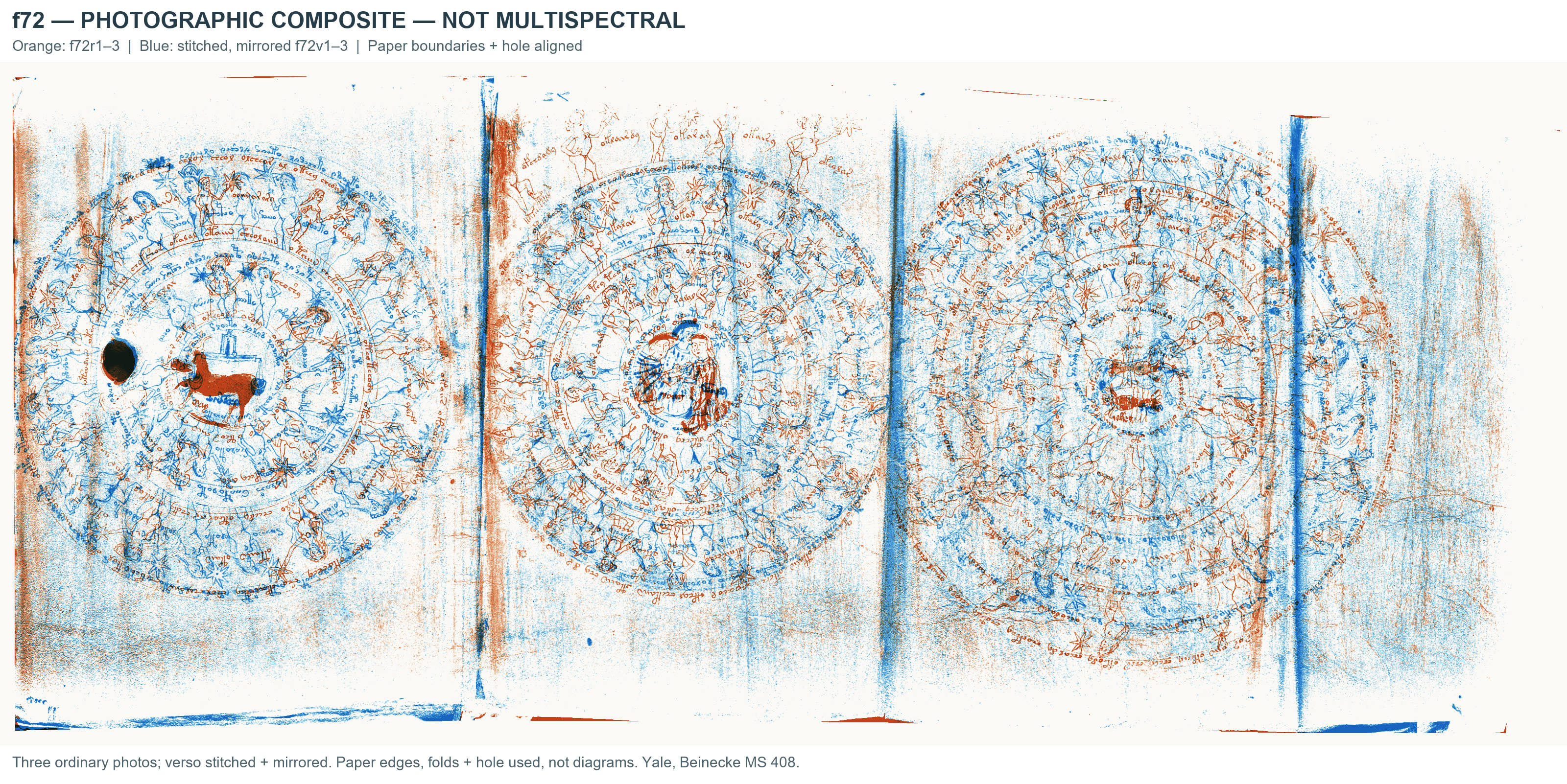
I was surprised recently with how much symmetry exists between the recto and verso sheets in zodiac and astro.
The multiscan for f70v1 is known to have bleed through from the underlying page. It turns out, you can bring out both pages in the multispectral. The spheres are a perfect overlap.
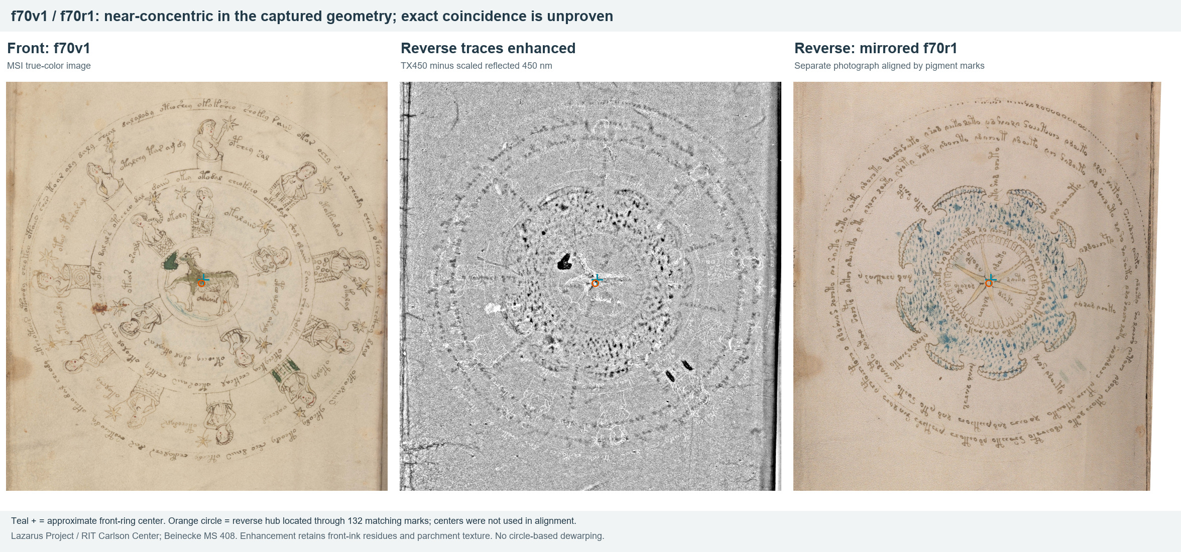
I have altered the coloring of this image so that each side has a different color.
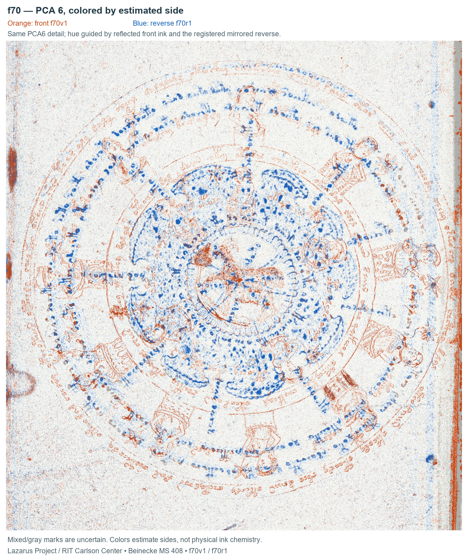
- The numphs on the top half all roughly align with the radial text on the other side, nearly perfectly. Ultimately there are only 9 radial segments and 10 nymphs in the same ring, but the spacing seems intentional.
- The stars that the nymphs are holding nearly perfectly line up with the outer ring of text on the other side of the page.
- The floating oooooooo band on f70r1 aligns perfectly with the ring on v1.
This symmetry even appears to go beyond the spherical diagrams. I noticed f68 has it as well. Even though the star diagrams are not circles, they align perfectly with the circles on the opposing pages. Note that these may not be perfect, I do not have page gutter DE warping for spherical diagrams, but you can see they clearly match up.
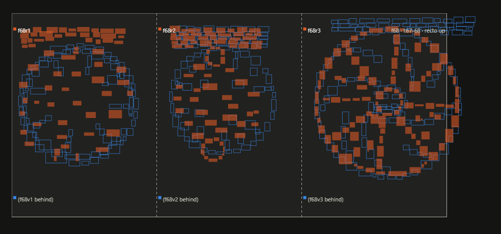
I don't have the multispectral, but i can create a composite that would show what this looks like. Unlike the multispectral, this one won't line up perfectly because of slight warping differences. You can see the bleed doesn't quite line up, but it is close.
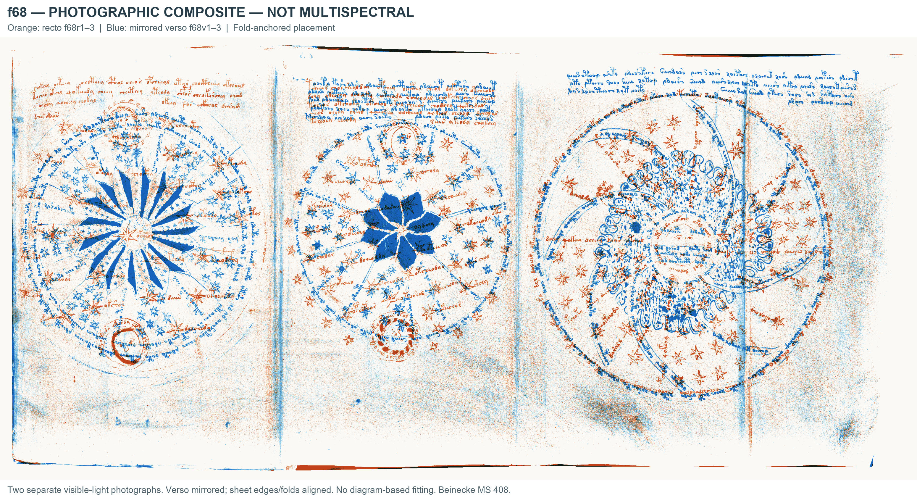
The spherical text, i can see being related somehow to the guide/circle process, but why the symmetry here with these stars? It obviously raises the question around if there is any intended link between these, and if the seemingly odd structures of each diagram somehow are supposed to give context relative to one another.
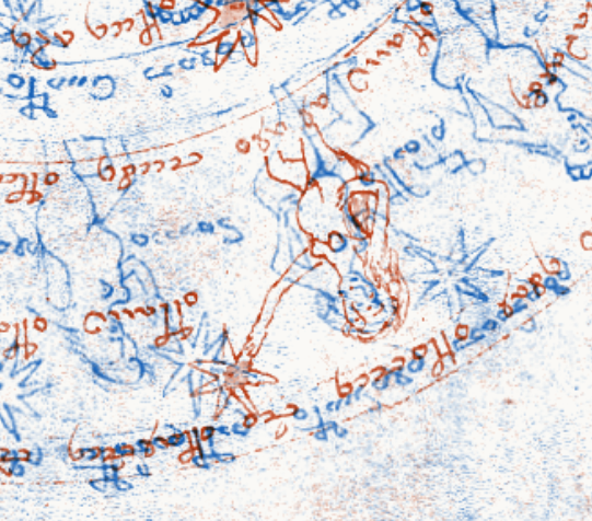
f72 also does the same thing, although my composite isn't as clean here, you can see the same exact overlap. It seems like many may even be drawn to have a star overlapping with the star of a nymph on the opposite side.
Is the long arm here intentionally to make these stars overlap?
|
|
|
|
| f57v and numbers |
|
Posted by: ololololo - 04-11-2026, 04:47 PM - Forum: Imagery
- Replies (3)
|
 |
I think it’s better to post this in the Imagery section rather than in my thread about the cipher, since it doesn’t relate to the cipher.
Studying the symbols of the 4x17 sequence on the f57v, I noticed one feature: all the symbols going from l to the second r (with the exception of x, v, which I consider to be a, and an incomprehensible symbol) can form bigrams with o: ol, od, or, ok, om? (maybe m = iin), of, ot.
If you number the first five characters from 1 to 5, you get a generally logical picture.

Then these same bigrams can be conventionally denoted as numbers:
ol = 12
od = 13
or = 14
oa = 15?
However, numbering the symbols in order doesn’t make sense — there will be 17 of them, and this number doesn’t give us any meaning.
After trying to find an alternative sequence that fits the number 17, I came up with the following:
1 2 3 4 5 10 11 12 13 14 15 20 21 22 23 24 25

If you number the symbols in this way, you can notice that the most common bigrams appear at positions up to x = 20. You can check for oy and oc — they occur much less frequently compared to the same or, ol, or ot.
This all seems like numerical logic, but it’s not that straightforward…
What do you think?
|
|
|
|
| Different parchment color through Herbal section? |
|
Posted by: Koen G - 04-11-2026, 03:41 AM - Forum: Physical material
- Replies (30)
|
 |
Many years ago, I undertook the cumbersome (and mostly fruitless) task of sampling all painted surfaces in the Herbal section in Photoshop, hoping to find differences between Herbal A and Herbal B. Apart from a shade of red that's famously absent from B, nothing was found. (See here: You are not allowed to view links. Register or Login to view. )
Now I thought, what if I dump the info from my spreadsheet in Claude, and let it find any patterns? Not much either. I also got it to resample some things - there may be something going on with differences between the greens, but that's not relevant now. Somewhere along the way, it spontaneously complained that Herbal B bifolios are lighter than Herbal A bifolios, so the comparison may be unfair.
What?
So it had been sampling parchment for some reason and decided that B parchment was lighter. This would be interesting if true, since A and B folios are mixed, so we could rule out the effect of photography.
I asked it to take new measurements. The new method was to take "400 random patches of clean parchment, about 2 mm square, from anywhere on the page. A patch only counted if it was uniform and at least about 4 mm from any ink or paint. That’s about 48,000 patches in total." The results matched, and became even a bit sharper.
It first tried to sell me on a scatter plot, since I generally prefer those. It looks impressive: B is mostly sorted, apart from Q8's usual shenanigans. The fact that precisely the tormented 55/66 bifolio sticks out like a sore thumb is remarkable.

However, you can never trust robots to see the full picture. I asked it to make a bar chart according to the current binding order:

This confirmed my suspicion: the first handful of folios are just kinda gross. Look at the difference between f2 - f7. Part of A being darker can be explained by increased exposure, which has little to do with the bifolio's surface.
Quire 4 is the first one where bifolios mix, and this contains some of the darkest A folios. But check the bar chart with individual leafs: bifolium 28-29 seems out of place. It is normal for A, but lives in a quire with A's two biggest outliers.
In all the other quires though, B is much lighter than A.
Quote:Results for Quires 4–7, where A and B bifolios are bound together:
Herbal B is lighter in every quire: by 0.9 in Quire 4, 1.0 in Quire 5, 1.8 in Quire 6 and 1.5 in Quire 7. If A and B labels were shuffled at random within each quire, a difference this large would come up about 0.5% of the time (p ≈ 0.005).
Adding Quires 8 and 17: the difference is +1.0 (p ≈ 0.03). Quire 8 is still the exception, because of f57/f66.
Bootstrap: I resampled both the patches on each page and the bifolios in each group, 1,000 times. Herbal B came out lighter every time, with a 95% range of +0.8 to +1.8.
Each part of the page separately: top half, bottom half, gutter side, outer side, rectos only and versos only. Herbal B is lighter in every quire in every case, by +1.0 to +1.4.
Hair and flesh sides: the difference is smaller on hair sides (+0.7) than on flesh sides (+1.9), but positive in every quire both times.
Yellowness: Herbal B is also less yellow, by about 1.7, consistently in all four quires.
So with a different sampling method and position taken out of the equation, Herbal B still sits on lighter, less yellow skins.
I don't know if this is convincing or not, or if any of this makes sense at all, but it sounds impressive. What's also remarkable is that in the "lost" Herbal folios among the pharma section, the A/B "lightness" split remains.
|
|
|
|
| Liaisons in the Voynich text |
|
Posted by: quimqu - 03-11-2026, 10:06 AM - Forum: Analysis of the text
- Replies (50)
|
|
Last weeks I have been deeping into the statistics of the VMS. I got stuck, as always... then I thougt that I'd better look at what the scribe never does, rather than at what he does... and found a new important rule (at least, I think it is new in this form, and important).
Inside a word, many glyph pairs never occur: n is never followed by k or t, y is never followed by o, there is no oo, no ya. Everybody knows this. What I found is that these same prohibitions keep working across the space between words. And this theory explains some curiosities of the VOynich text. When the last glyph of a word and the first glyph of the next one would be one of those forbidden pairs, the scribe puts a glyph in between. When the pair is fine, he mostly doesn't.
It works like "a pear / an apple": the extra letter only shows up where two letters would clash.
An example: The word taiin. When the word before ends in n, r, d, s or m (glyphs that cannot stand before a gallows inside a word) it is written ytaiin, 23 times out of 23. When the word before ends in o, y or l (ot, yt, lt are normal inside a word) it is written taiin, bare, 21 times out of 30.
Same with kaiin (ykaiin 80% of the time after a clash, 36% without), aiin (daiin 94% against 45%), okaiin (qokaiin 73% against 34%), ar (dar 80% against 23%).
I detected four glyphs and four clashes:
| word before ends in | next word starts with | glyph put between | with clash | without |
| n, r, d, s, m | a gallows (k, t, p, f) | y | 69% | 23% |
| n, r, d, s, m | a gallows (k, t, p, f) | o | 95% | 70% |
| o, y | o (okaiin, ol, okeey) | q | 63% | 23% |
| o, y | a (aiin, ar, al) | d | 89% | 34% |
The known "-y then q-" (Currier) and the "yk / yt after a drawing" (MarcoP and Emma May Smith) are two cases of this.
I wrote the tests down before running them, and they all hold: the same word in both contexts, each of the three hands separately, Currier A and B separately, and on text I hadn't looked at when I found it (rings and labels). It is graded: the rarer the pair inside a word, the more often the extra glyph appears. And if you look at the word two positions back instead of the neighbour, the effect vanishes. Only the word written right before counts, and the line break resets it.
It is not a hard rule. Of all the word pairs that would clash, two thirds get the extra glyph and one third don't. For a fifteenth century hand I think that is what a rule looks like (this is something that I suppose; I mean, ortography rules may not have been as strict as nowadays)
But the same glyphs do other things too: y and o before a gallows also mark a restart: after a drawing gap, at the start of a label or of a radial line, a gallows word carries y or o almost always (95-100%), with nothing before it to clash with. q is the opposite, it almost never starts anything (12 labels in the whole book begin with q), but inside a paragraph it is at 58% at the start of a line, whatever the line above ended in. d is at 98% at the start of a line.
So, what about the space between the words? I have the position of every glyph on the scans, so I checked whether the extra glyph depends on how far apart the two words are. It does. q is a "close" form: after a clash, 82% of o-words carry q when the two words are close, 34% when the space is wide. y and o before a gallows are there at any distance after a clash, but without a clash they appear when the space is wide, as a restart. d doesn't care about the distance. And a clash left unrepaired comes with a slightly wider space.
The space between words is not a clean cut. The constraints that hold inside a word keep acting across the space, and the scribe had four glyphs to deal with it. If there is a language behind the text, this is what sounds do when speech runs on and not when it pauses (French liaison does exactly that), and the q that only appears when the words are written close together fits that picture rather well. If there is no language, it is a procedure that looks one glyph back, and at the pen, before choosing the shape of the next word. I can't tell these two apart. What I can say is that the exceptions are not noise: they follow the position and the distance, each glyph in its own way.
Comments and constructive attacks (  ) welcome, as always. |
|
|
|
| Hair side, flesh side and Gregory's rule in the VMS |
|
Posted by: quimqu - 01-11-2026, 05:28 PM - Forum: Analysis of the text
- Replies (7)
|
|
This started with something small. A while ago I said in another thread that I had a result about the letter t that wasn't published yet. This is it, and it took me further than I expected. It ends up being about the parchment more than about the text. Long post, sorry.
In the herbal pages of hand 1, the outer pages of each folded bifolio (the first recto and the last verso) have more t, compared to k, than the two inner pages. I took the 21 bifolios of hand 1 that have all four pages and compared t/(t+k) outside and inside. The outer pages have more t in 18 of the 21, by about 0.13 on average (p 0.0002 if you shuffle the four pages inside each bifolio).
My first idea was the skin. The outside of a folded bifolio is one side of the skin and the inside is the other, so maybe t is written differently on hair and on flesh. To check that I needed to know which side each page is, and everybody says that in this manuscript you can't tell. Well, I tried...
I tried colour first (hair is usually yellower) and it didn't work. What does seem to work is the texture of the blank parchment. One side of each leaf is clearly grainier than the other, and often has small dark dots that look like follicle holes. In the pictures the grainy side is on the left and the smooth side on the right, always two sides of the same leaf. The bottom row is the same patch with more contrast.


f14 is the biggest difference in the book. In f94 the grainy side is the verso, and you can see the dots. f112 is there because arca_libraria wrote that You are not allowed to view links. Register or Login to view. is a hair side ("you can easily see the follicle dots"), and in my measurement You are not allowed to view links. Register or Login to view. is indeed the grainier side. That is the only outside reference I have, so when I say grainy = hair it rests on that one page.
How I measured it, because I know someone will ask. I used the full-size Beinecke images, around 300 ppi. On each page I cut 10% off every edge, so the border and the neighbouring page are not counted. I converted to Lab colour and only kept pixels close to the normal colour of that page (within 2 MAD of the median in L, a and b), which leaves out the ink, the paint and the paint that shows through from the other side. On what's left I took the lightness minus a blurred copy of it (Gaussian, 3 pixels), which keeps only the very fine variation, less than about half a millimetre. The number for the page is the spread of that (MAD × 1.4826). Grainy pages give around 4 to 5, smooth ones 3 or less. There is no fixed threshold: for every leaf I compare the recto with its own verso and call the higher one grainy. That way differences in lighting between photos don't matter much. For a bifolio I add the differences of its two leaves, and if the total is under 0.25 I call it doubtful and measure again in many small windows over each side. I wrote these settings down before measuring and didn't change them after.
Before believing it I needed a way to check it, and the manuscript gives one. The two leaves of a bifolio are the same piece of skin, so both must say the same thing about which side is outside, and they are photographed separately. They agree in 46 of 50 bifolios. The four that don't have one leaf where the two sides are almost the same, or come from foldout photos that I had to cut in two, which is the roughest part of all this. The second check is the middle of each quire (f4v/f5r for example), which is always the same side of the same skin. The grain gets it right in 12 of 14 quires, and the two misses are again cut foldout photos. Colour gets only 3 of 7, which is why I dropped it.
So, back to t. In hand 1's herbal the side that ends up outside changes from bifolio to bifolio, 8 grainy-out and 13 smooth-out. The outer pages have more t in both groups (7 of 8 and 11 of 13), and there is no relation with the skin side (correlation 0.10, p 0.68). It's not the skin. The scribe wrote more t on the outer pages of the folded sheet, whichever side they were. I can't tell from the text if that is the start and end of a writing session, or writing those pages with the sheet closed.
Once I could read the sides I couldn't resist looking at Gregory's rule, the usual practice of making facing pages always hair against hair and flesh against flesh. In a quire of nested bifolios that means the outer side alternates from one bifolio to the next. I downloaded the pages and foldouts I didn't have and did all of them:

Quire D follows it exactly. C, E and F have two of each and would follow it if two bifolios were swapped. A, B, G and the balneological quire can't follow it whatever the order, and in A all four bifolios have the same side outside. The two pharma quires have both bifolios the same way round, which doesn't work for a nested quire but works fine if the pharma bifolios were loose single bifolios. Stolfi and Lisa have already suggested that, and the two lost pharma bifolios were singletons. In total I get 24 bifolios grainy-out, 27 smooth-out and 1 I can't decide.
Then I looked at the missing leaves. The herbal block (quires A to H) had 33 bifolios before it was mixed up: seven quires of four and quire H with five. If all of them followed Gregory you would need 17 of one side and 16 of the other. What survives is 14 grainy and 16 smooth, and the three missing ones are 59/64, 60/63 and 61/62 in the middle of H, which Lisa thought might have been herbal. The numbers only come out right if those three were all grainy, or two grainy and one smooth.
Just as a puzzle I tried to put the 33 back into eight quires that all follow Gregory, keeping bifolios with similar text together (glyph transitions, nothing else). What comes out is that npcompl33t's groups make complete quires on their own: 1.5a one quire, 1b two quires, and the Herbal B pages another. The three missing bifolios always end up with group 1a, which is the group with too many smooth-out bifolios. One of the possible orders, outside to inside, * for the missing ones:
1/8, 43/46, 42/47, 58/65
2/7, 20/21, 4/5, 28/29, 49/56 (the quire of five, all 1a)
25/32, 59/64*, 35/38, 60/63*
9/16, 19/22, 10/15, 36/37 (1b)
11/14, 12/13, 18/23, 44/45 (1b)
17/24, 3/6, 51/54, 52/53 (1.5a)
33/40, 41/48, 34/39, 50/55 (Herbal B)
26/31, 27/30, 57/66, 61/62*
Please don't take this as the original order. The skin only says the sides must alternate, and in a quire of four with two of each that leaves 8 of the 24 possible orders. There are many other arrangements about as good as this one. All it shows is that an herbal made of Gregory quires with similar text in each is possible with what we have.
Now the weak points, and there are a few. This isn't a standard method and nobody has checked it against the real parchment. Which side is hair depends only on f112r, and what I call grain could be the follicle holes of the hair side or the velvety surface of the flesh side, I don't know which. That doesn't matter for Gregory, where only "same or different" counts, but it does matter for "24 hair-out". It depends on the photos, focus and JPEG compression, which is why I only ever compare the two sides of the same leaf and use the two leaves of a bifolio as the check. At 300 ppi a follicle is one to four pixels. From the 4 bad bifolios out of 50, a single leaf is wrong maybe once in 25. Some leaves don't show any difference (f73, f76, f85, f90, f95), and f73 is a single leaf, so it stays undecided. The cut foldout photos are the least reliable part.
So, the conclusions: the t effect is only in hand 1's herbal, and in the other hands it's weak or not there. The missing bifolios in the puzzle are only placeholders for their skin side. The two-and-two balance inside groups 1b and 1.5a could happen by chance about a third of the time. And npcompl33t's groups and my text similarity come from the same kind of measure, so it's no surprise that they agree.
If someone who can see the manuscript (Lisa? René?) wants to check, these are the leaves where my measurement is clearest. The recto should be the grainier side in f14, f32 and f8, and the verso in f54, f99, f66, f107 and f65. If that holds on the parchment, the rest probably holds too. If not, I've been measuring something else...
|
|
|
|
| Bifolia created using previous as reference |
|
Posted by: npcompl33t - 01-11-2026, 06:06 AM - Forum: Theories & Solutions
- Replies (29)
|
|
Hello
Using the spatial analysis toolkit i shared recently, I believe I have found very convincing proof that previous bifolio were used in the creation of a new bifolio. You are not allowed to view links. Register or Login to view.
Using my recovered spatial coordinates, i can gather two measurements: margin offset, and text angle. Viewing the bifolia in the correct sequences shows that these values carry over between most bifolia, while slowly drifting over time, and serve as a completely text-independent marker of production sequence.
Below we will see how:
- Layfield and Davis singulion hypothesis is correct
- Previous bifolio were use to set the margins and text angle of the current bifolio.
- Broad Golf Sequencing Holds
- This can help to resolve uncertain orderings.
Margin offset can be measured in the following way:

Plotting these values by page-within-bifolia immediately reveals trends that are related to bifolio face:

This can then be combined with the angle of the text. This is essentially how slanted the text is on a page. For example, You are not allowed to view links. Register or Login to view. has significant slant. This appears to be far more common on the outer Bv page of a bifolio, which makes sense. To create a singulion, it would be justified in the opposite direction from the other 3 pages.

Bifolio were written in the same singulion order proposed by davis. The first page of this singulion is typically preserves the least offset. The final page frequently accumulates an offset and slant completely independent of the other 3 pages, that will also carry over between pages.
But it can be hard to picture how these graphs may relate to the actual pages.
You are not allowed to view links. Register or Login to view., allows you to view these in sequence, directly above one another, bifolio to bifolio. You can also drag a bifolio up, to see what it would look like to lay it on top of the previous sheet.
When arranged in my proposed golf ordeering, these horizontal offsets and offset angles form clear sequences. I am not claiming this is the perfect order. But it is clear that it is close, and many pairs likely do capture true production sequence. We can see that the angles and offsets from previous bifolio are frequently copied to the next.
Here is the beginning of the manuscript. This shows the pages in singulion order. Note the extreme angle of the right-most page, which carries over between the bifolia seperately from the offsets of the other 3 pages.

Here is a slightly different ordering

The stars section appears to have had the sheets at least partially obscured by the new one. You can see the margins mostly align if you arrange them at covering around 50% of the previous. After about 50%, the margins diverge, sometimes sharply.

Again, I am not claiming the exact sequence is correct, and encourage others to try swapping the ordering. It is clear that in many cases, previous bifolia were used as a layout reference for the one being produced, as margin offset, and text angle get reproduced on the newer bifolio.
The next step will be to analyze this data more thoroughly to determine the most likely possible parings.
- EDIT: You are not allowed to view links. Register or Login to view. Several small chains are identified. The first several bifolia in the manuscript form the largest sequence.
- EDIT2: You are not allowed to view links. Register or Login to view. using these new measures than their 1st or the current golf ordering. The uncertainty involves 75|84, which has arguably the most complex typography in the manuscript, and doesn't form a strong connection to any of the other bio sheets on these metrics.
|
|
|
|
| The hidden structure of the VMS |
|
Posted by: npcompl33t - 01-11-2026, 12:33 AM - Forum: Analysis of the text
- Replies (8)
|
|
At first glance, the layout of the Manuscript can seem chaotic, especially with how some of the text is interleaved in the Herbal Sections.
However, there is clear structure that is currently being obscured by the - a) the binding order and
- b) severe page distortion due to gutters and vellum shrinkage
- c) good old human error
Using the new toolkit i shared in the tools section, I was able to correct for page distortion and off angle text, and a striking picture emerges, that is different for the two Herbal sections.
The following shows a heatmap that reflects the % of all pages that have text in a given area. The horizontal bars represent image breaks that occur. You are not allowed to view links. Register or Login to view..

A large percentage of Herbal A pages feature some kind of image intrusion, that will split the text. When overlayed, these seem to fall into a type of double column layout, with the different image gaps forming a remarkably rectangular shape. Its also striking how little of the page consistently contains text, just a tiny portion of the top left corner.
The comparison with herbal B is stark. Herbal B features a clear fully defined text area extending the entire horizontal width. The images in this section tend to occur in the direct center, dividing the page into more like 3 different segments.
There is one page with the image break outside of the center zone. seems to start out in this 3 column format.

There are also many pages that would co-occur in the innter faces of a bifolio, that exhibit quite a bit more symmetry than may originally appear.

For example, the image gaps in You are not allowed to view links. Register or Login to view. and You are not allowed to view links. Register or Login to view. are almost identical, despite You are not allowed to view links. Register or Login to view. having a line covering the top. f49v-f56r have odd expanding areas and sharp gaps. When combined, these odd areas fill each others voids and share a common angle. f36r-f37v have an obvious left /right symmetry.
You even see these on the two opposing sides of a bifolio, although they seem to take different patterns. Many will have a paragraph at the top and middle on one side, while the opposing side will have a paragraph at the top and bottom, starting at the point the paragraph on the opposing sheet ends.

One final tinfoil hat theory for fun. I personally doubt this is true, but I feel some could have a lot of fun with this. Because the images cut so cleanly through the text, a question might be if the same image mask, applied to a different page, would highlight specific words, as in the following.

You can experiment around with this You are not allowed to view links. Register or Login to view..
|
|
|
|
|