


06-06-2025, 02:33 PM
Indeed some space saving can be observed around those "big" letters, but this is mostly done otherwise:
p and f are followed by all small letters without problems (and are never directly combined).
But if there is a leading letter, very often this can be seen:
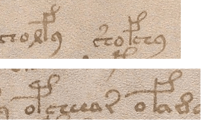
The front-end curl is just straightened to keep away from small leading letters.
So p and f are not simplifications of t and k (they are all already simplified), but similarily developed and just lifting a leg:
If I had to "invent" or simplify an alphabet, I would try to keep the character set simple also.
Those things can continue to be different letters at all.
p and f are followed by all small letters without problems (and are never directly combined).
But if there is a leading letter, very often this can be seen:
The front-end curl is just straightened to keep away from small leading letters.
So p and f are not simplifications of t and k (they are all already simplified), but similarily developed and just lifting a leg:
If I had to "invent" or simplify an alphabet, I would try to keep the character set simple also.
Those things can continue to be different letters at all.
